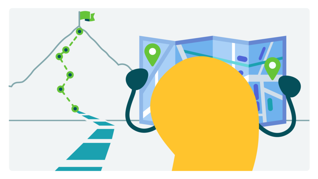
Dear readers, let’s take a little trip together — no luggage required. We’re talking about journey maps: one of our favorite tools in the user experience (UX) and health communication toolkit.
Let’s start with the basics: What exactly is a journey map? Journey maps are visualizations that illustrate the steps people take to accomplish a task. In the world of public health and health care, journeys could include signing up for health insurance, filling a prescription, or even navigating a new diagnosis. In addition to breaking down how people get from point A to point B, journey maps help us identify roadblocks that they may encounter and emotions they may experience along the way.
Why bother mapping a journey? Because the best design starts with empathy. Journey maps are health comm game-changers because they can deepen your understanding of the challenges your audience may face. That insight can help you create more intuitive communication materials that reflect readers’ needs and experiences. A good journey map helps you step into your audience’s shoes and anticipate potential bumps in the road — confusion, frustration, maybe even dread — so you can smooth the path. As the brilliant folks at Nielsen Norman Group put it, journey maps “create a shared vision” of the user experience.
Most journey maps have 5 key ingredients in common:
- Actor (or persona): the person whose journey you’re mapping
- Scenario and expectations: the situation they’re in or task they’re trying to complete
- Journey phases: the major stages they’ll go through on their journey
- Actions, mindsets, and emotions: what they’ll do, think, and feel in each phase
- Opportunities: places where you (yes, you!) can make the experience better
You can start to gather those ingredients by learning about your audience through formative research activities like interviews, usability tests, surveys, or focus groups. The goal is to ground your map in real people’s experiences, not assumptions.
Then, the magic really happens when you bring the whole team together around a journey map. Suddenly, your developers, designers, and subject matter experts can literally see the same picture. That shared understanding of users’ experiences can help everyone make more informed choices.
Ready to start your journey (map)? Here are a few tips to guide you:
- Start simple: You don’t need fancy design software to create a journey map. Sticky notes on a wall (or a virtual whiteboard) work great.
- Co-create with your audience: Invite audiences to react to your draft map. They’ll spot gaps you never would have considered.
- Look for pain points and bright spots: In addition to pinpointing challenges, journey maps can help us identify and build on elements that are working well. Turn each opportunity for improvement into a design decision, a product feature, or a plain language edit.
- Pair with personas: A persona describes the “who” — the people you want to reach. A journey map describes the “how” — the steps they’ll take to accomplish their goal.
- Revisit often: People’s journeys evolve over time, influenced by technologies, policies, or social trends. Updating journey maps can help you track those changes and adapt your communication strategy to stay relevant.
The bottom line: Journey maps are empathy in action. They help health communicators visualize the real ups and downs of people’s experiences — and design clearer, kinder, more effective solutions.
Copy/paste to share on social (and tag us!): Take a journey with CommunicateHealth to learn all about journey maps for #HealthCommunication. https://communicatehealth.com/wehearthealthliteracy/are-we-there-yet-using-journey-maps-to-guide-health-communication/ #HealthLiteracy
Browse recent posts